The Circus | Process

‘The Circus’ was an illustration I had been wanting to do since I finished my Wild Adventure piece, many moons ago. My intentions were to produce a series of illustrations that had a similar composition and layout – a parade of characters with a flat, side-on look to them that I thought would work well as a print series. I had other ideas for this series but the circus theme seemed like a good starting point.
Initially I started sketching a few characters – clowns, strongmen, ringmasters etc. to get a feel for how the characters might look. My Wild Adventure piece was drawn in such a way that the animals were sketched separately and then brought together as a final composition and I had initially thought of approaching this piece in the same way.
My focus for this piece shifted after the initial sketch work. I had spent the majority of 2015 finding my feet selling my artwork at local markets and setting up and running my online store. As with most things in life, this took far longer than anticipated, but proved time well spent. I knew by the end of that year that I needed some new pieces of work that would appeal to my current customers but could also be used for self promotional purposes for freelance work.
With that in mind, I decided to target the piece towards a field of illustration I have always been heading towards without actively seeking. Working for children’s publishers has long been on my to-do list and although many people consider the work I do to be firmly planted in that field, I knew I needed a more targeted portfolio of work if I wanted to land book contracts or cover work.
To begin this illustration, in addition to the previous sketches I had made, I pulled together a “mood board” of inspiration (largely from my go-to inspiration cave – Pinterest) and just began to draw. I don’t always do thumbnails per se unless I’m working for clients and on this occasion I had enough in my head to just get something down on paper (digital paper – that is).
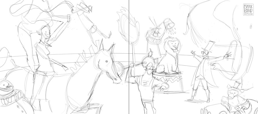
The first sketch had a good feel to it, I imagined that this would work well as a children’s book double page spread. I could also see how the (imagined) narrative would fit alongside. The problem was, I had the difficult task of trying to create something that could work both as a print for a child’s bedroom as well as a spread for a children’s book. I decided I needed more dynamism. I wanted a showpiece that would look great on the wall and could also be used as a splash page for a child’s book – the big reveal, if you like.
I don’t always do preliminary sketches with my personal work because I sketch digitally and can often work out compositions as I go. This approach allows me the freedom of not really knowing how the piece will turn out. This is not an approach I use for professional work but I think it worked well for this piece.
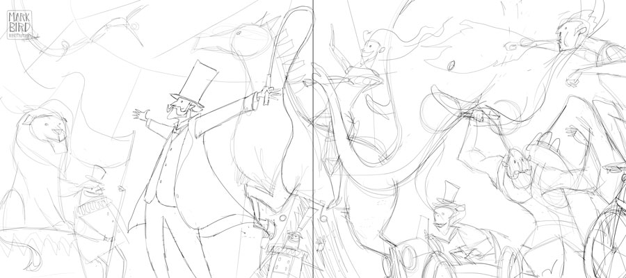
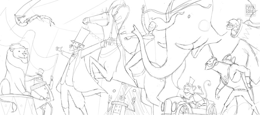
As you can see from the new sketch, I decided that a low angle shot and more complex composition would add to the heightened sense of excitement that I felt was needed. The composition was designed to flow, leading the eye in a roller-coaster of curves from the trapeze artists and flag, through the ringmaster and horse riders arms, to the curve of the tusk and beyond. The central line in the sketch dictates where the spine of a book would be and was included so that I left any important design aspect out of this area. Once the sketch was roughly how I wanted it, I cleaned up the lines as much as possible. My process doesn’t necessitate that I work with clean lines but I find that the more detail and clarity I put in at this stage, the less time the following step takes. I decided to simplify the right edge of the piece as there was a little too much distraction in an already complex illustration. Plus, I wanted the strongman to be looking into the piece, in line with the direction of the other characters, drawing the eye back in from its edge.
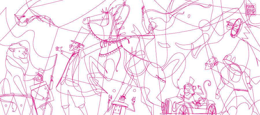
Once a finalized sketch is complete I work up to what I call “flats” – vector outlines of every shape I’ve drawn. I begin by tracing the outlines of my sketch and building up the illustration one piece at a time. Using an outline to each shape allows me to see through to the sketch underneath. Once the lines are complete these are blocked in with simple colours in the same manner as you would if you were painting traditionally. This is the process I use for all my illustrations and gives me the freedom to easily change any aspect that I feel isn’t working.
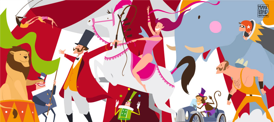
The colours at this stage are somewhat irrelevant. I try to create a rough palette that works together but the majority of the colour work is done in the texture stage. This stage is where the illustration comes to life. My main challenge is to create contrast from one adjacent shape to the next while maintaining the overall balance and harmony of the piece as a whole. Each character has to stand out by itself without demanding too much attention, allowing the eye to move around the piece naturally as intended.
As you can see from the final image, a fair amount of small adjustments including the main background colour change, gave the illustration added warmth as well as making sure none of the characters merged into their surroundings. Careful colour choices, such as the greens of the flag, clown and strongman, were positioned in an attempt to keep the eye moving around the image and create a sense of balance and harmony across the piece as a whole.
If you are interested in this piece for your wall or as a gift, you can find it in the store.
Get in Touch
If you wish to commission me for any children's, character, editorial or any other work please get in touch via the contact page and say hello.
My work can also be found on the following social media sites: